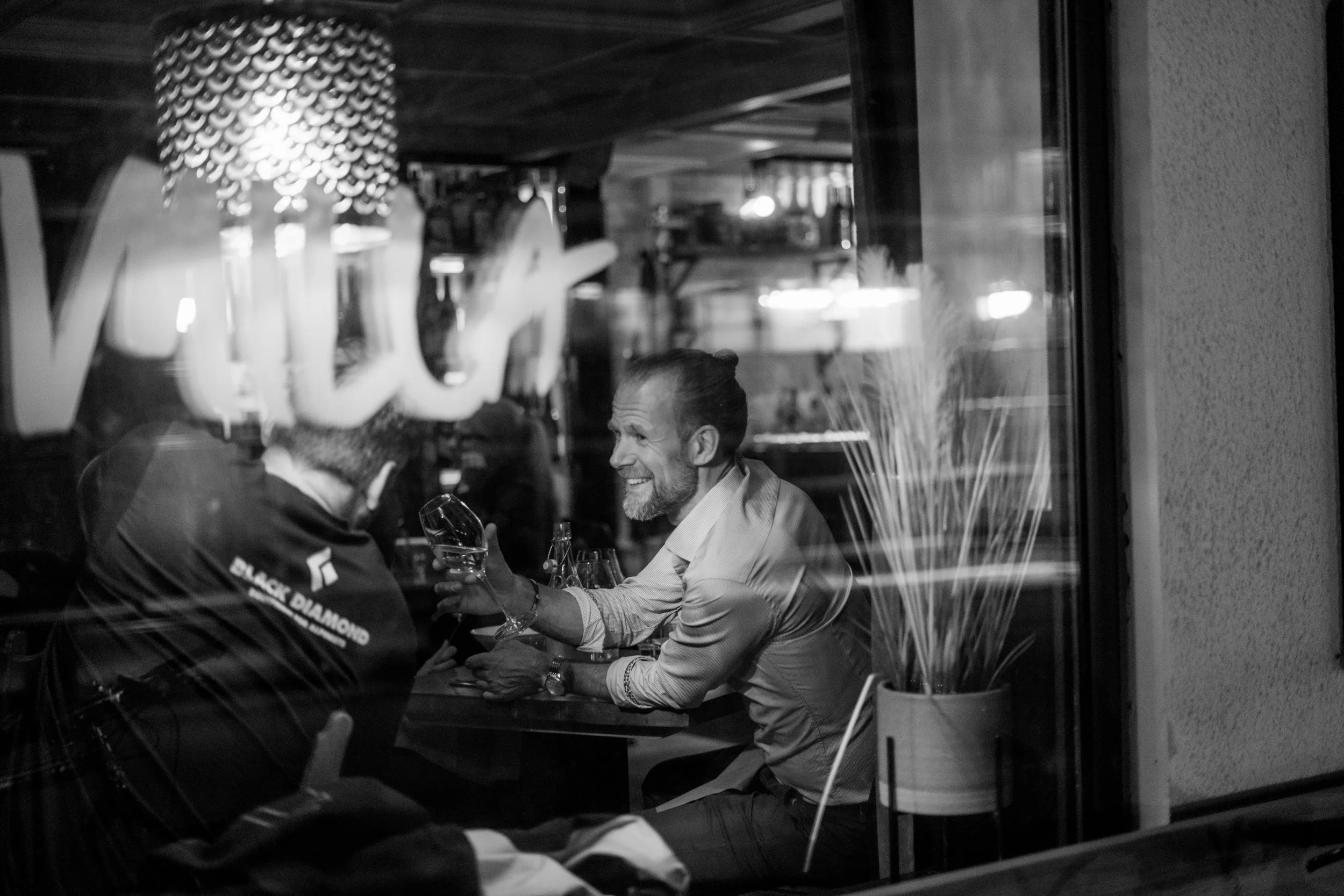
Imilla
Building a neighbourhood restaurant with personality.
Imilla is an independent restaurant in Åre built around great food, good company and an informal atmosphere.
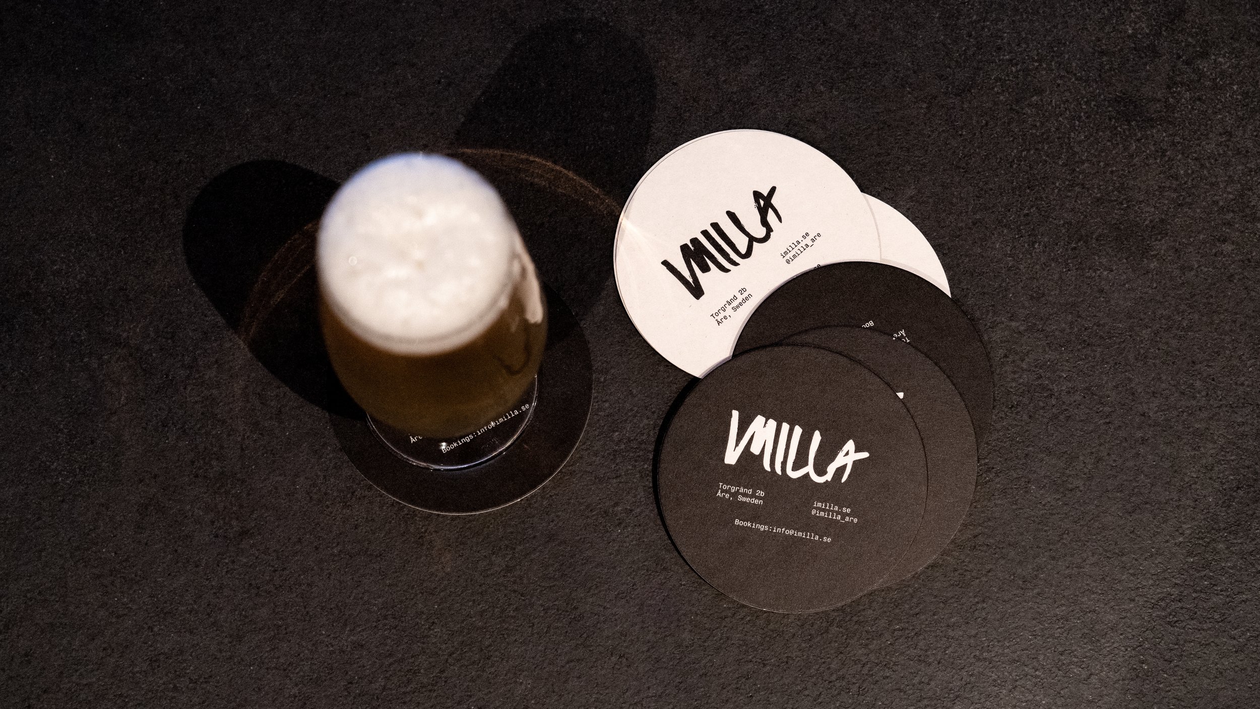
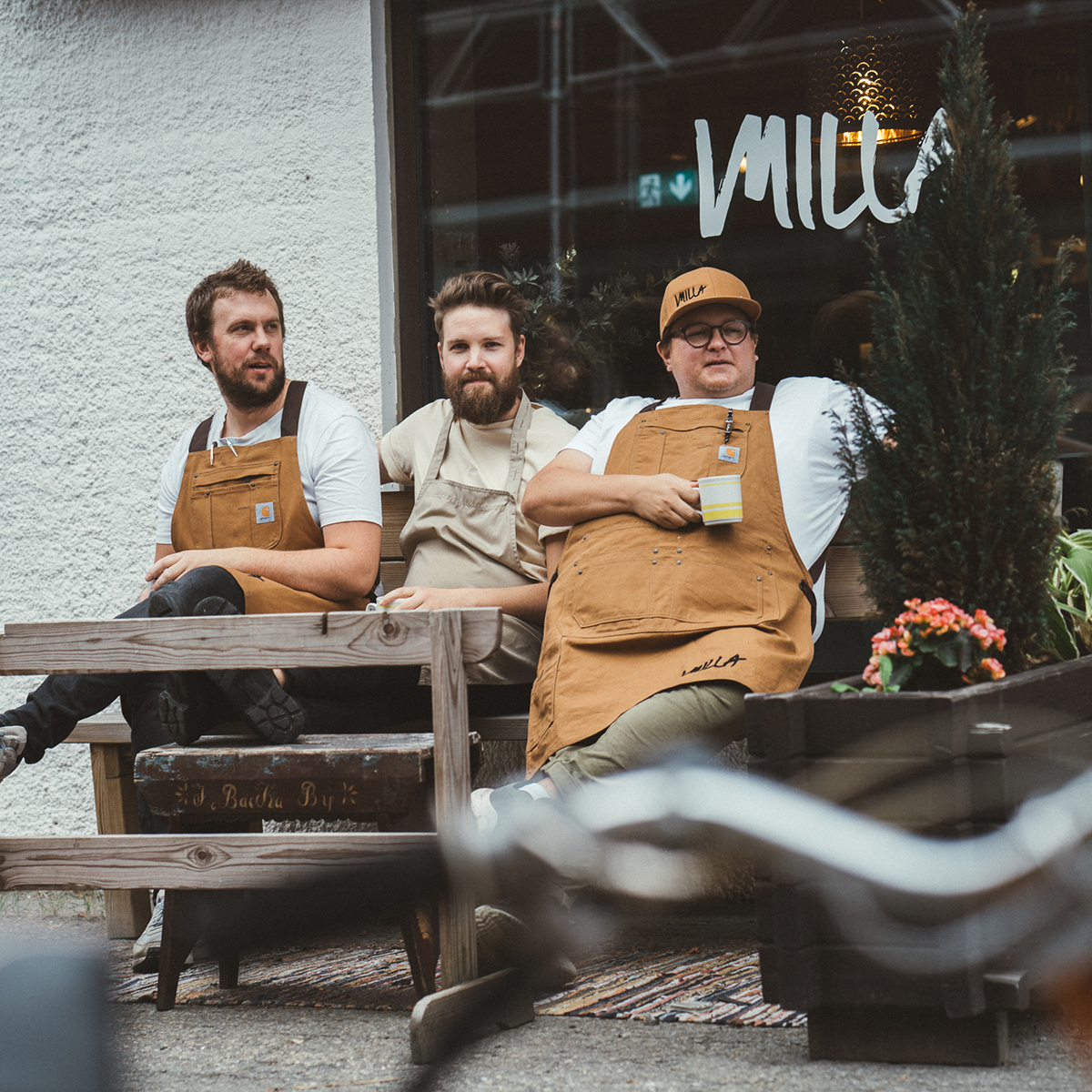
The ambition wasn't to create a polished restaurant brand—it was to capture the personality of the people behind it and translate that into a visual identity that felt authentic from day one.

The Challenge
Small hospitality brands rarely need more design.
They need the right design.
For Imilla, the challenge was to create an identity that reflected the relaxed atmosphere of the restaurant without feeling generic or overdesigned.
The brand needed to work equally well on blackboards, menus, social media and signage while remaining unmistakably personal.
The Solution
Rather than inventing a visual style from scratch, we built the identity around elements that already existed inside the restaurant.
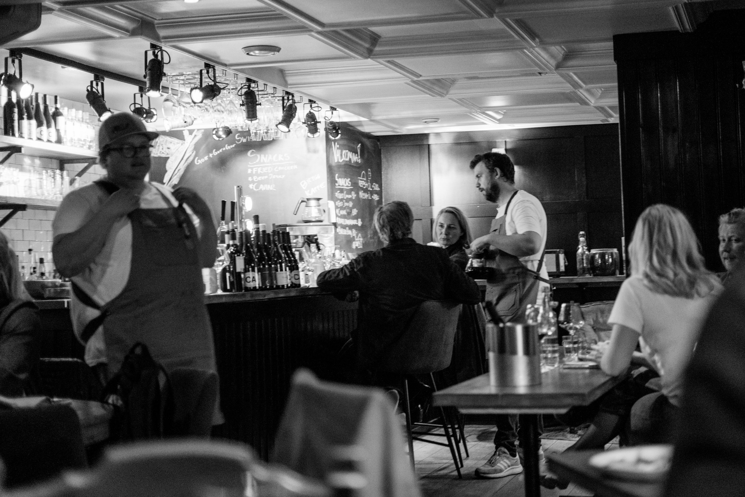
The logo was based on one of the founders' own handwriting, while the visual language took inspiration from the handwritten chalkboards used to present the daily menu.
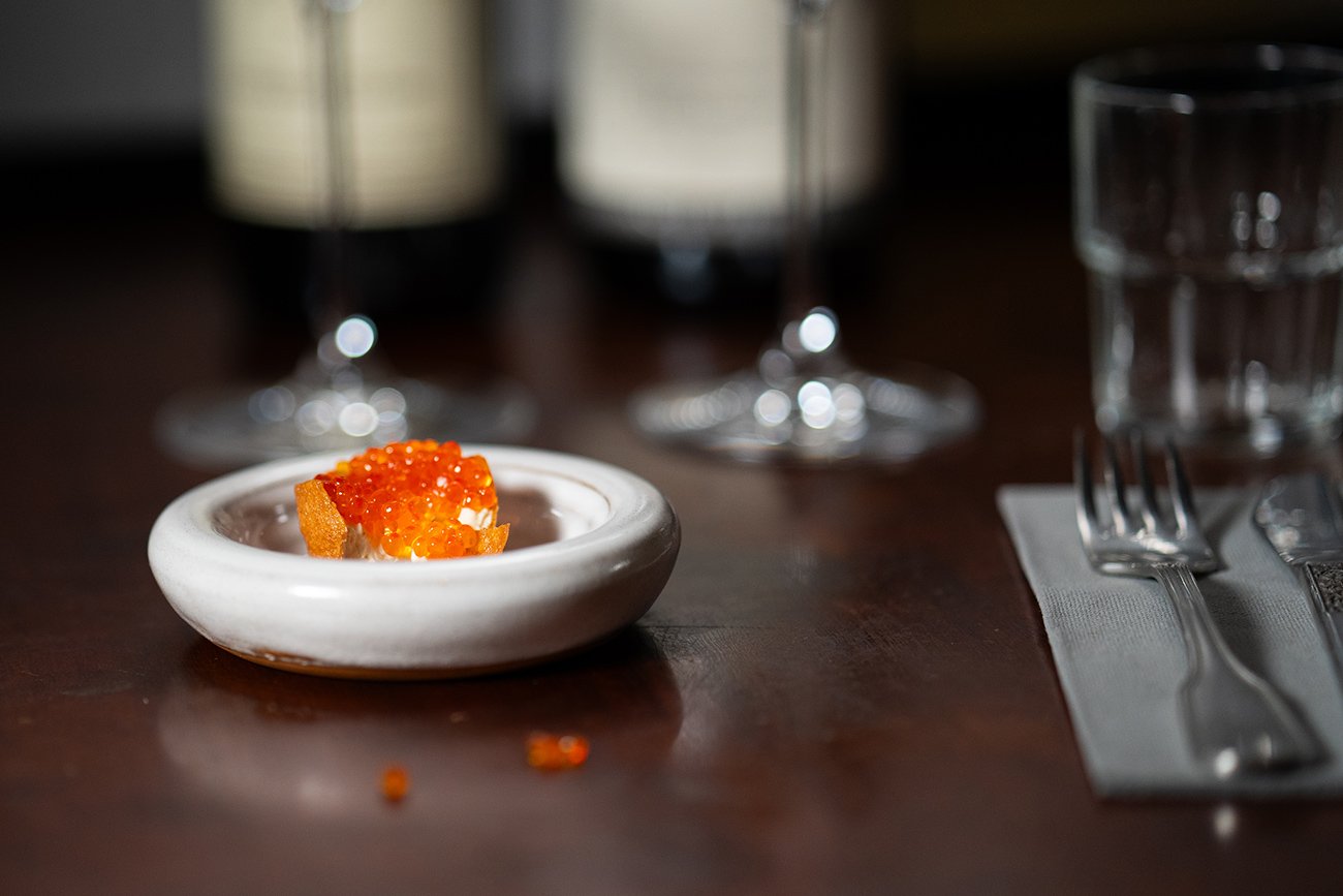
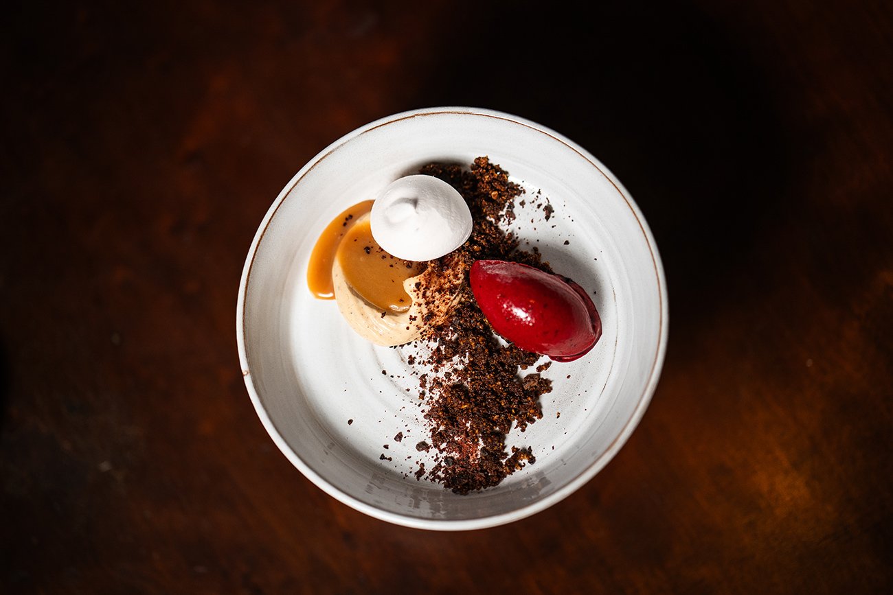
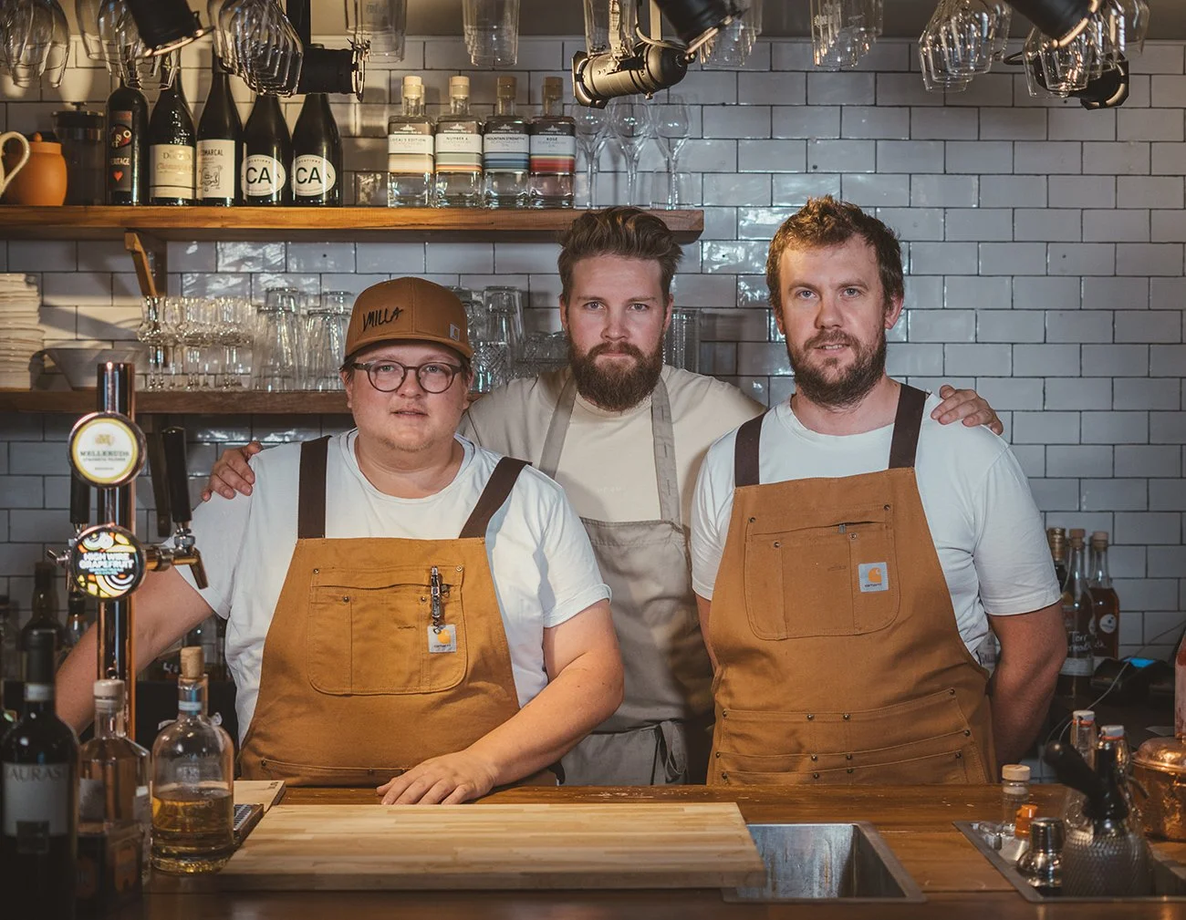
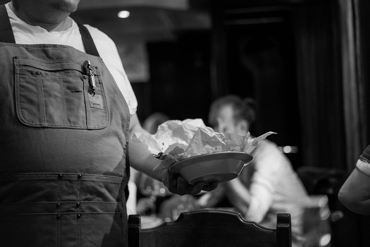
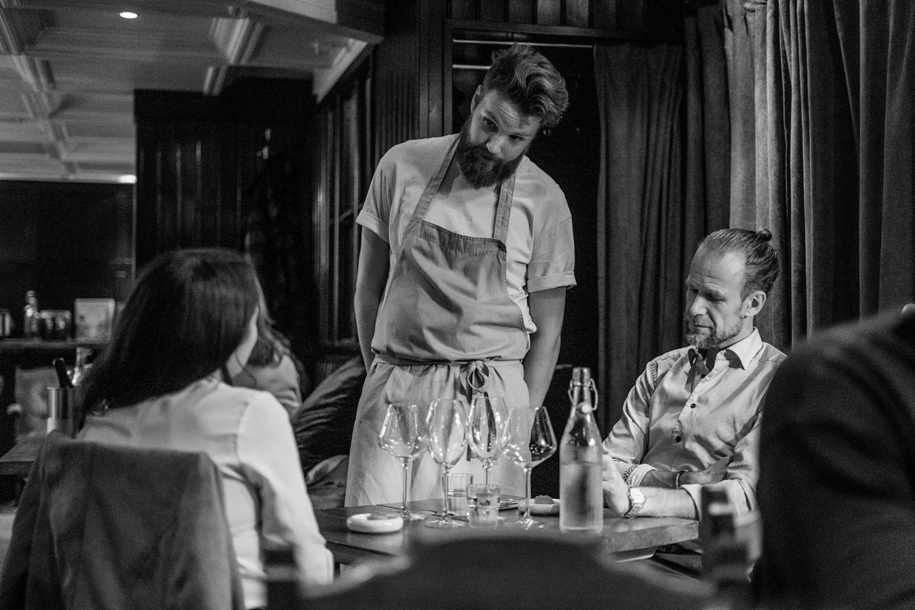
A restrained black-and-white palette, honest typography and documentary-style photography created a brand that felt natural rather than manufactured. The photography by Viktor Öhlin helped reinforce the atmosphere across the website and social channels.