E/S-A
A visual identity built with the same precision as the architecture itself.
When Engstrand Speek Architects decided to rename the practice, the goal wasn't simply to design a new logo. It was an opportunity to create a visual identity that reflected the firm's architectural philosophy: restrained, intelligent and carefully considered.
Working closely with the founders, we (Osbeck Design + Patrick Sundqvist) developed a brand where typography, proportion and composition became as important as the symbol itself.
The Challenge
Architectural practices often struggle to differentiate themselves visually without becoming decorative or predictable.
The challenge was to create an identity that felt timeless and distinctive while reflecting the clarity, precision and confidence found in the firm's architecture.
The new name also needed to become a natural part of the visual language rather than simply sitting beside it.
The Solution
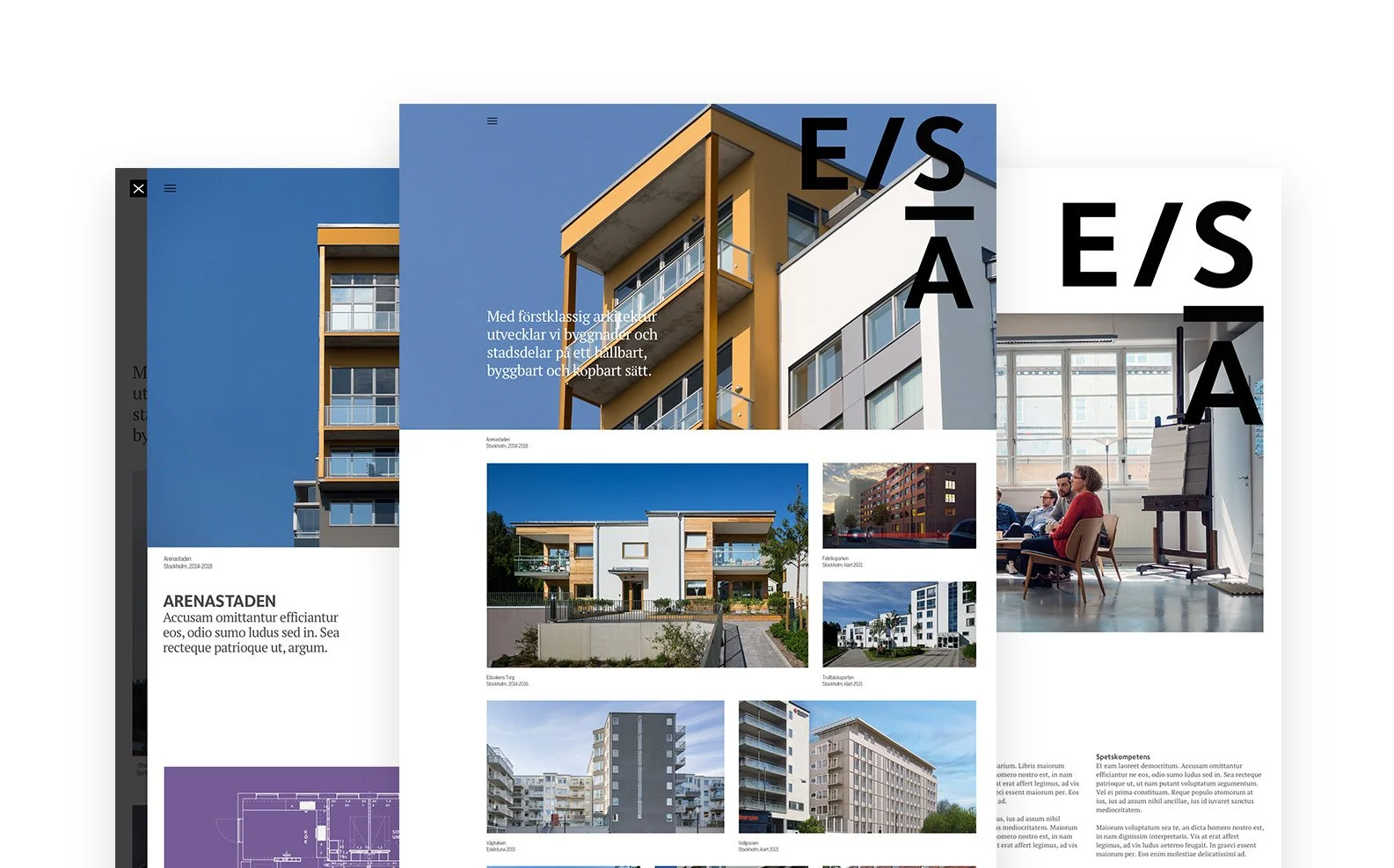
We developed a minimalist identity built around the new name, E/S-A.
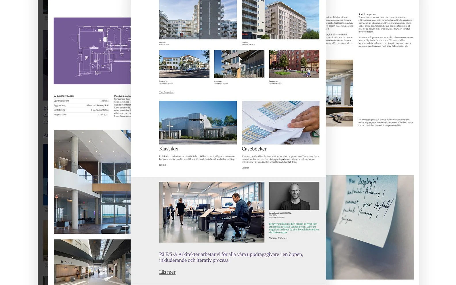
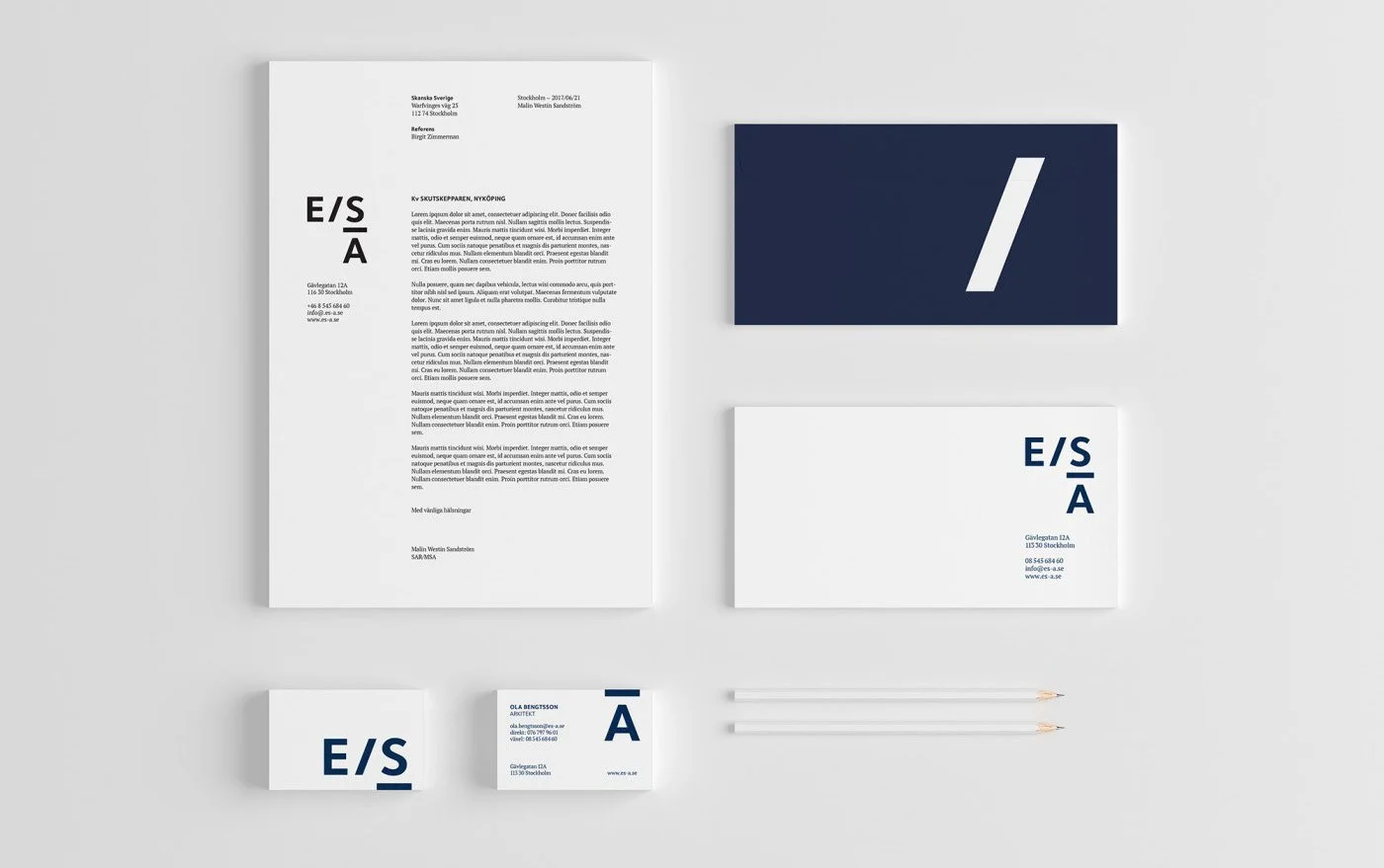
Rather than relying on expressive graphics, the system uses typography, spacing, geometry and composition to create recognition. The letterforms behave almost like architectural elements—structured, flexible and carefully balanced.
Across business cards, stationery, presentations and digital applications, the identity reveals itself gradually. In some applications, the complete mark isn't visible until the object is opened or unfolded, creating small moments of discovery that echo the thoughtfulness behind the architecture itself.
The result is a brand system that feels restrained without becoming anonymous.