
This is Nuts
Packaging that stands out—without driving up production costs.
This is Nuts set out to offer a healthier alternative to traditional snacks through premium nuts and dried fruit.
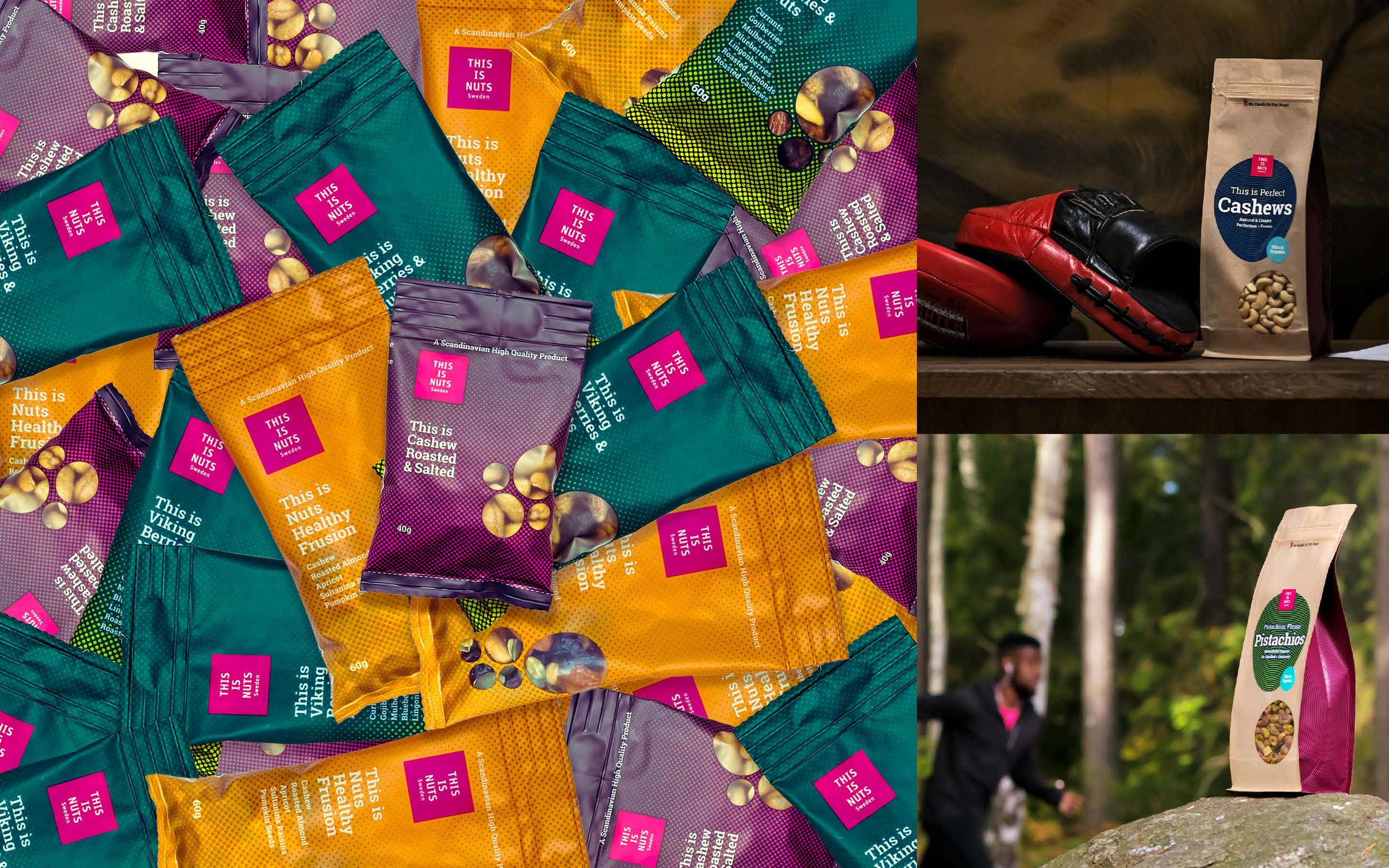
Over several years, I worked closely with the brand to develop its packaging and design strategy, creating a visual identity that balanced shelf impact, production efficiency and long-term brand consistency.


The Challenge
In retail, packaging has only a few seconds to communicate quality, personality and value.
The challenge was to build a distinctive identity that could stand out in a crowded category while remaining flexible enough to accommodate new products, formats and campaigns without increasing production complexity.
The Solution
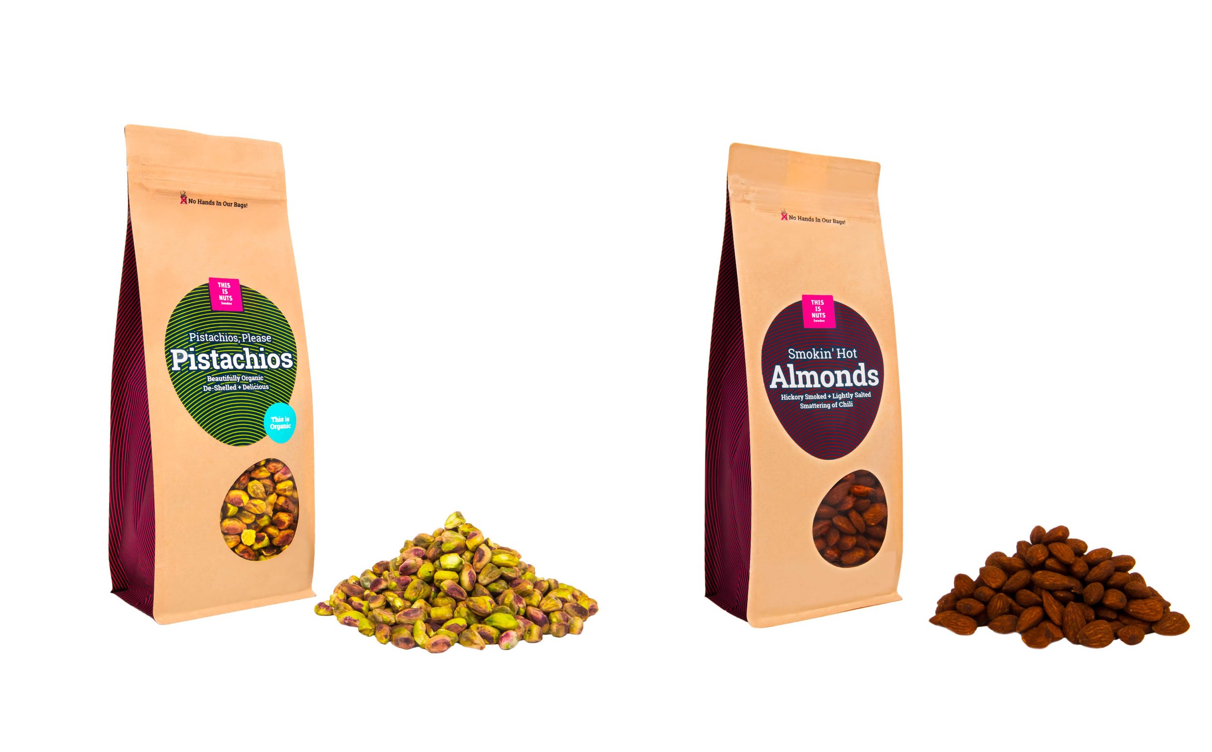
We developed a packaging system built around bold typography, confident colour combinations and a clear visual hierarchy.
Instead of treating each product as a separate design exercise, we created a scalable framework that allowed the range to grow while maintaining a consistent brand presence.
Every design decision balanced creativity with practicality, ensuring the packaging remained both commercially effective and cost-efficient to produce.
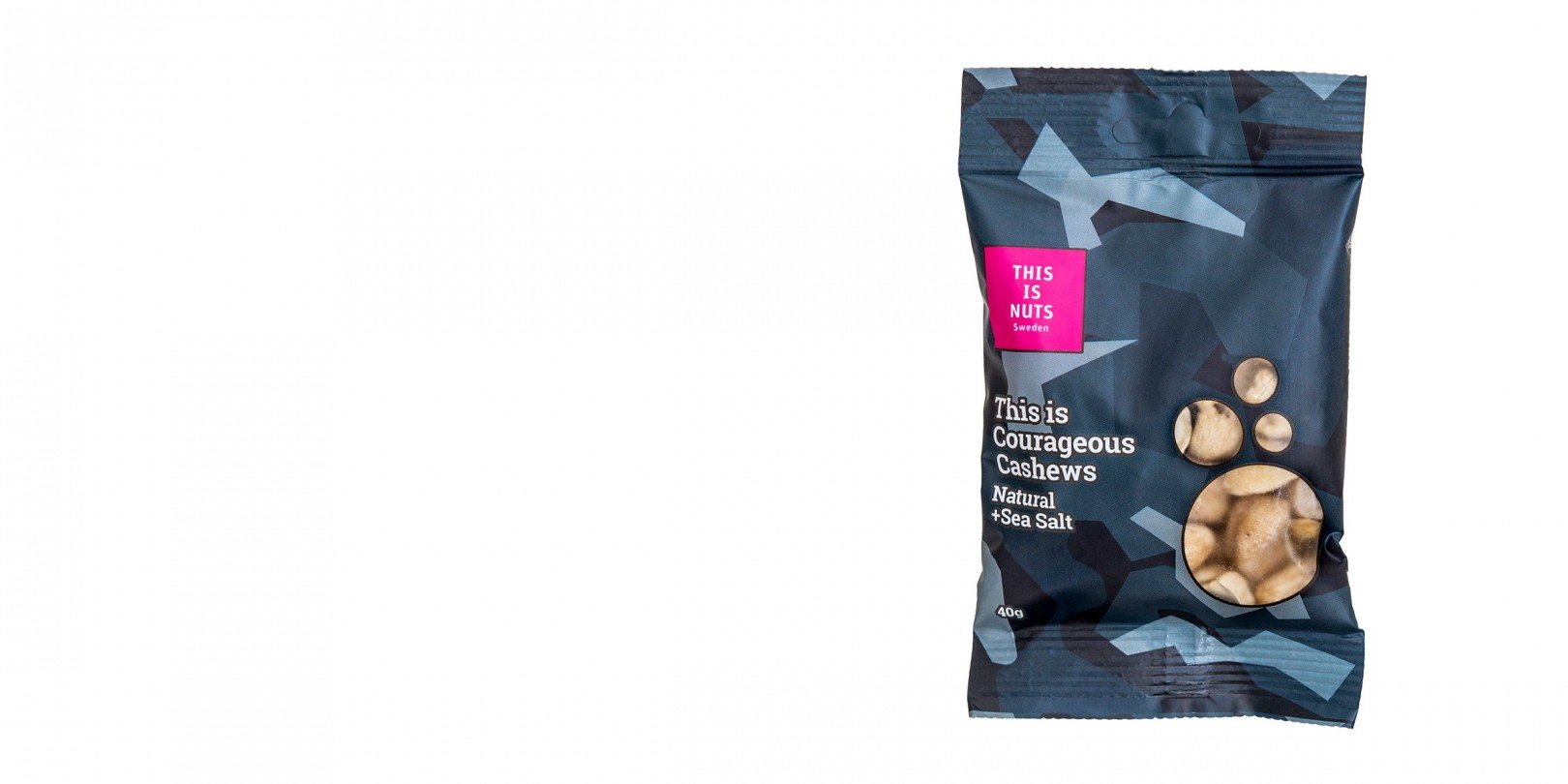
The result is a flexible packaging system that gives the brand a strong presence on shelf while simplifying future product launches.
The project demonstrates how thoughtful packaging design can strengthen both the customer experience and the commercial performance of a growing consumer brand.